Bartering experience built for mobile & tablet (iOS)
Bartering is a powerful community builder, and in a densely populated city like New York, the pandemic made the disconnect between neighbors apparent. During the pandemic lockdown, Xi’an residents in China turned to WhatsApp to barter supplies within the same building as resources started dwindling down. How might we foster community building through trading goods?
This is a solo, conceptual project.
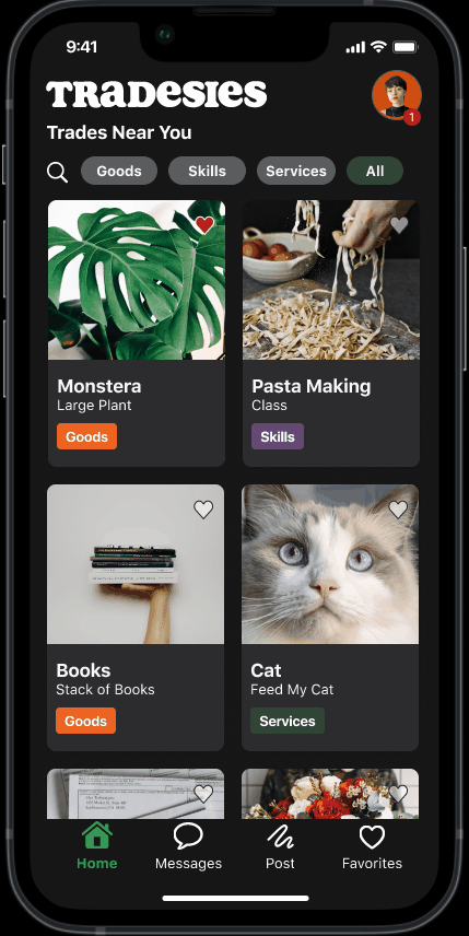
Home screen
Seamlessly showcased a variety of available trades with filters on top for easy navigation
Pre-selected messaging prompts help facilitate initial conversations
GPS determines public meeting spaces, eliminating the back-and-forth on where to meet
“ Everything is clear and visually appealing. I had no issues navigating from one screen to the next. I appreciate the pre-selected messaging prompts because I’m not sure how to start the conversation with a stranger.” (usability feedback)
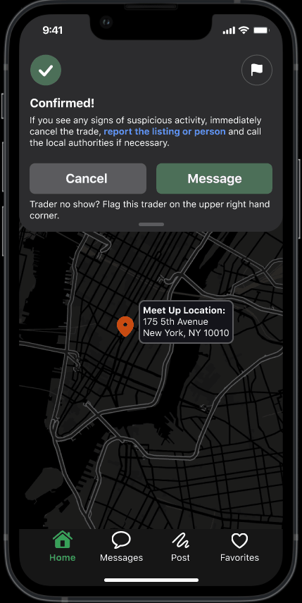
Confirmation screen
Confirmation page with options to cancel, message the trader, and view the public meeting spot on a map
Accountability: When the trader next signs into the app, a smiley rating system will indicate whether the trade went well or not
“I like the emojis for rating instead of the 5 star rating because it simplifies the overall process.” (usability feedback)
Relevant research insights
01/ Pain Point
Users dislike the idea of meeting up at each others homes for exchanges.
“How might we prioritize safety so that users can have a positive experience during the exchange?”
02/ Pain Point
Users are often annoyed during the negotiation process because it takes too long.
“How might we focus on accessibility for the user to ensure clear communication throughout the process to avoid confusion?
03/ Pain Point
Users liked the idea of being friendly with their neighbors but are unsure of how they can get to know them.
“How might we foster a positive environment for the user so that they can find common ground with their neighbor during the exchange?
High level goals
01/ Prioritize Safety
Direct traders to a public meet up location based on their current locations to avoid meet ups at their homes. Also providing safety tips and best trading practices on the app.
02/ Make it Accountable
Focus on accountability and ensures all communication to be done through Tradesies.
03/ Make it Accessible
Help guide the bartering process by requiring a clear explanation of trade being offered in order to eliminate any unwanted surprises.
Synthesis: App map
I created an app map to further understand how the users will navigate the main user flow in order to inform my design decisions on the overall structure.
Home screen iterations
❗ “Am I searching through the entire app or just for trades?”
The search bar caused initial confusion for users so I re-visited the hierarchy of the layout.
❗ “Where does the back arrow take me back to?”
The back arrow is removed from the final iteration because there was no need to go back once you’re logged in.
✅ Filters were clear, slight modifications in terms of spacing for the final design.
Message screen iterations
❌ “I thought the confirm trade button was the send button. When do I use that button vs. the send button in the chat box?”
This screen was a challenge because my attempt to streamline the exchange process ended up making it more cumbersome.
Confirmation screen iterations
The final iteration has a success state with “confirmed!” message and safety tips to build trust with the user. The actions are more simplified with the map showing location clearly and an overall polish UI.
Design guidelines
Tablet design

Scaling up from mobile provided more opportunity to showcase additional items like map of current location and displaying tips for a positive trade experience.
Tablet dashboard iterations
Low-fidelity iteration
❌ What users said: Vertical navigation bar was quickly abandoned as it took up too much real estate.
✅ What I did: I proceed to create my first round of hi-fi iterations with changes before doing another round of usability testing.
High-fidelity iteration
❌ What users said: There are too many trades listed throughout the dashboard and users don’t know where to look.
❌ What users said: “Popular Near You” felt like spam and would not browse.

Final design
✅ Carousel style cards for each trade are enlarged to address information overload and to avoid overwhelming the user.
✅ Search bar features auto suggestions to help users predict based on entered characters with a limit cap at no more than 10 auto suggestions to not overwhelm the user.
✅ Cleaned up the overall layout for a cohesive experience.
Takeaways & next steps
It’s okay to pivot
At the start of the project, my teammates and I had the intention of prioritizing the community bonding/social interaction aspect of this app by using bartering as a tool. After our user interviews and new findings, we quickly abandoned this approach and re-evaluated the new priorities.
What about monetization?
Raise funds by aligning with a foundation and their grants
Exist under an umbrella of a mutual aid, non-profit
Utilize crowdfunding platforms